The internet has a word for low-quality AI content: slop. And the conventional wisdom is simple — don't make it. Use AI responsibly. Curate before you publish. Quality over quantity.
That advice sounds wise. It's also wrong — or at least, it skips the most important step.
We've spent six weeks building tabiji.ai from zero to 700+ destination pages, 386 local guides, 324 itineraries, and 200+ short-form videos across Instagram, YouTube, and X. We now publish 21 videos per day across 10 active formats, plus daily Pinterest content, weekly resource articles, and an open API serving 1,428 JSON files.
None of it started good. All of it started as slop. And that was the point.
The Case for Deliberate Slop
Here's what nobody tells you about AI content production: you can't know what works until you ship what doesn't.
The instinct is to plan. Research your audience. Study the algorithm. Craft the perfect format. Then launch. This is how traditional content marketing works, and it makes sense when each piece costs $500 and two weeks of a writer's time.
But when AI drops your marginal production cost to $0.30 per piece, the calculus inverts. Planning is expensive. Shipping is cheap. The fastest way to learn what resonates isn't to theorize — it's to produce 15 different formats, publish all of them, and let the data tell you which ones to keep.
That's not recklessness. That's the scientific method applied to content.
The Graveyard: Formats We Killed
We've tested over 15 video formats for Instagram Reels in the last month. Most of them died. Here's the kill list — with actual screenshots from the posts we axed:
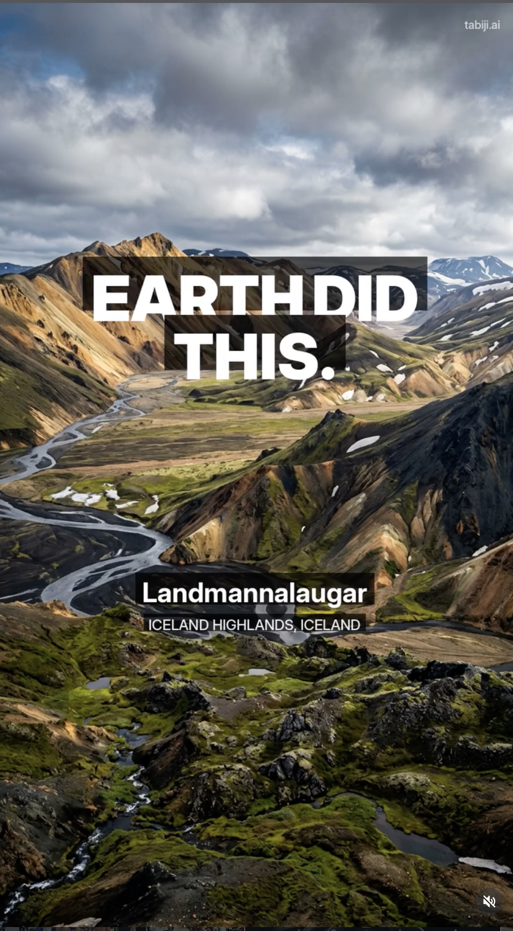

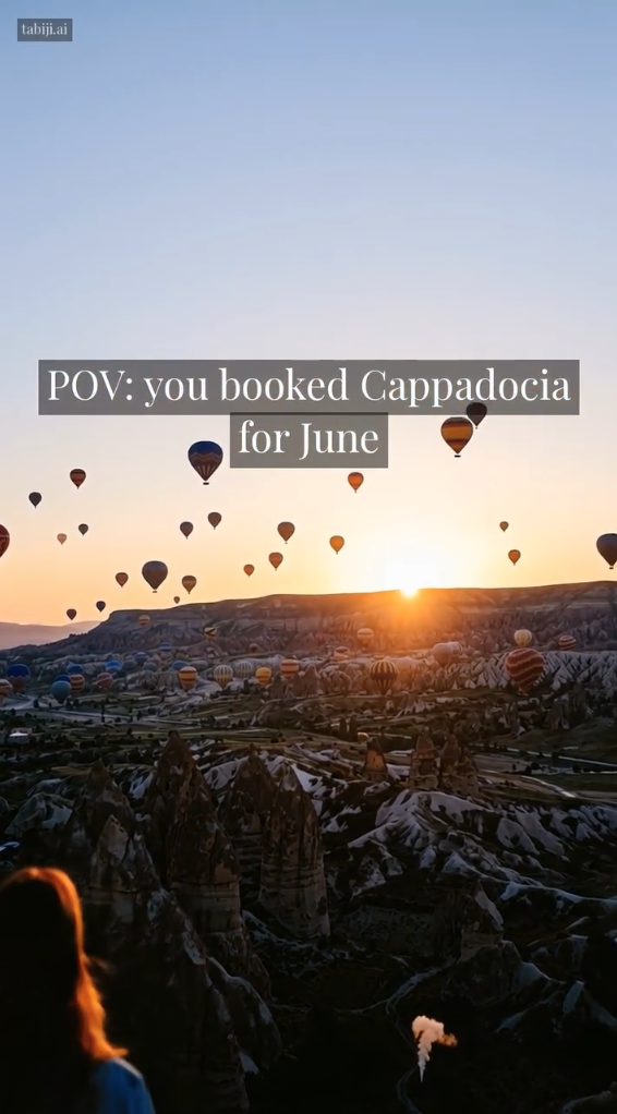

Every one of these looked good in isolation. Cinematic AI footage of Cappadocia at sunrise. A nostalgic 1961 Berlin POV. Iceland's highlands with dramatic text. They all felt like they should work. That's the trap — aesthetic appeal doesn't equal engagement.
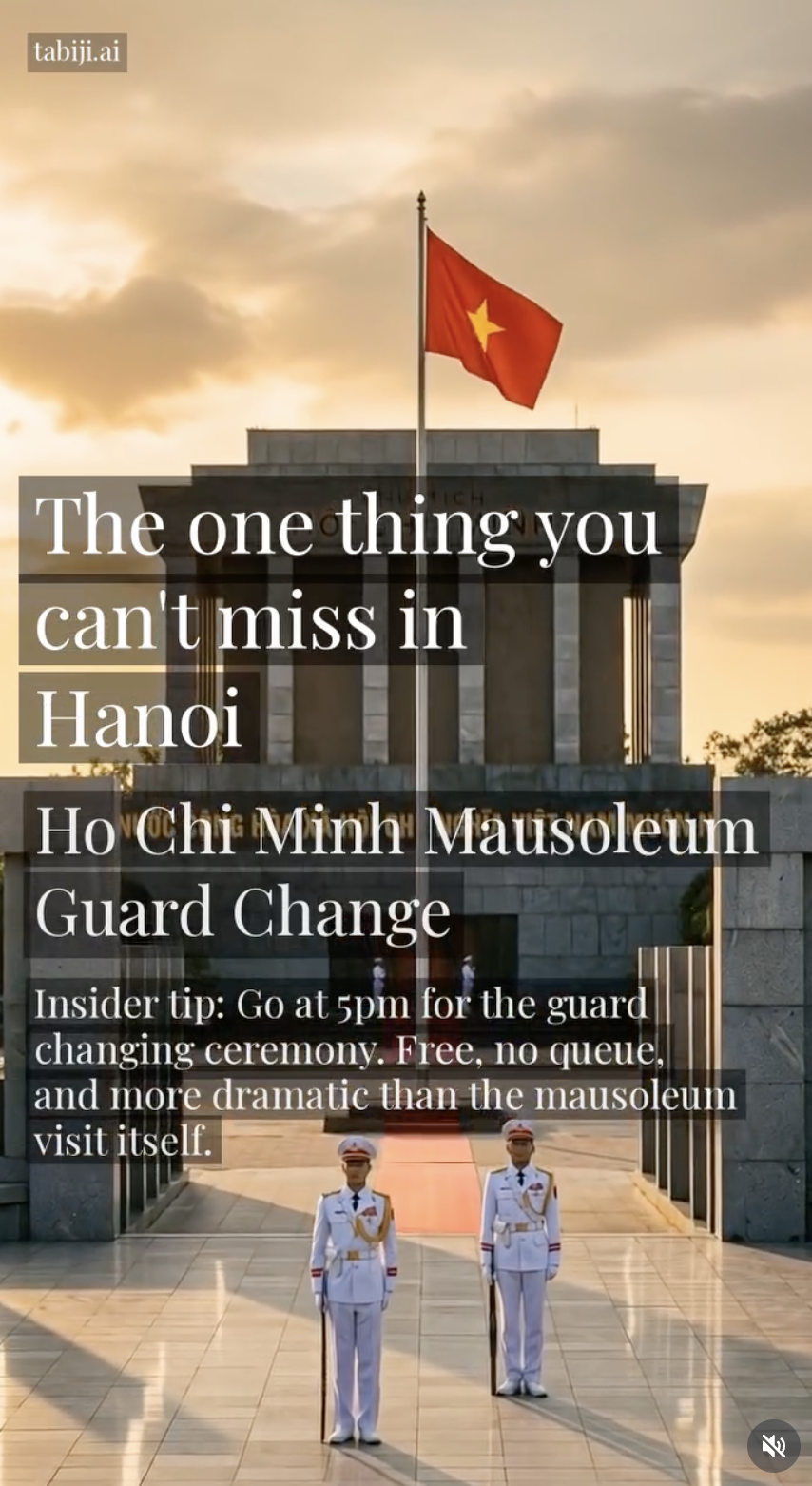
"POV: Destination" & "One Thing You Can't Miss"
Beautiful footage, clean text overlays, solid production. Averaged 9–134 views. Nobody saved them, nobody shared them. The format was indistinguishable from every other travel account on Instagram. When you can't tell whether a human or AI made it and it doesn't offer anything useful, you've just made wallpaper.
"Vintage POV" & "Natural Attractions" Reels
The Vintage POV format (8mm-style AI footage of historical cities) was beautiful to watch and terrible on Instagram — 110–134 views. The Natural Attractions format ran into a double problem: the content wasn't differentiated enough, and using copyrighted music meant constant takedown risk. The lesson: aesthetic content without a hook doesn't trigger saves or shares — the two signals Instagram's algorithm actually rewards.
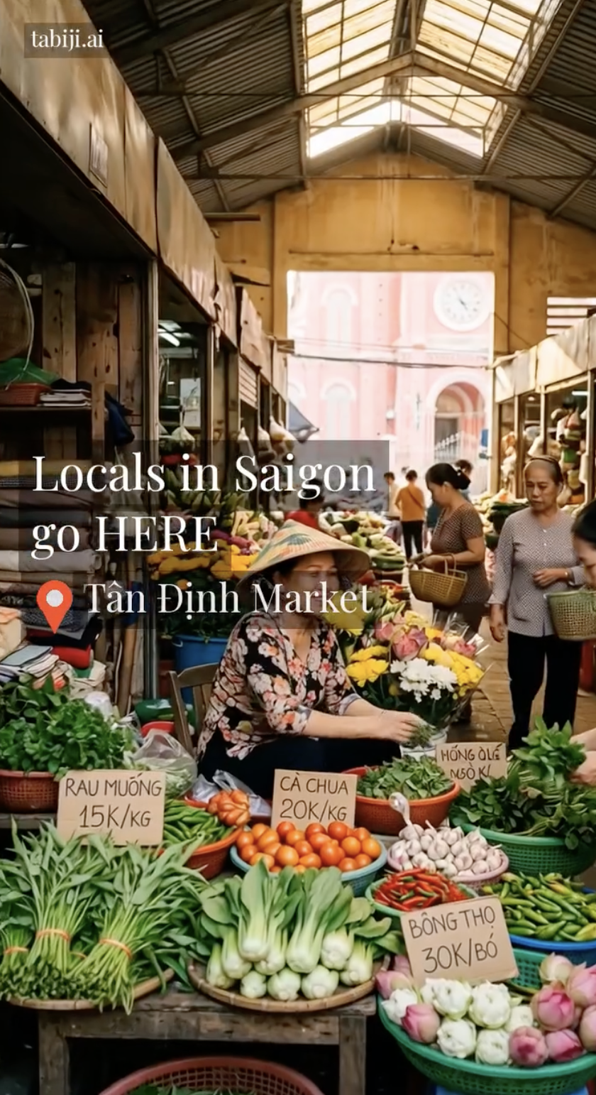
"Tourists vs Locals" Reels
The concept was solid — show where tourists go, then reveal where locals actually eat/shop/hang out. But the attraction selection was off. Picking the right local spot requires real insider knowledge that AI models don't reliably have. Without Reddit-sourced specifics, the "local" recommendations felt just as generic as the tourist ones.
"Countries as Personalities" Reels
"If Countries Were People in Your Friend Group" — AI-generated scenes of each country's personality stereotype with flag overlays and Ken Burns animation. The concept was fun and shareable in theory, but the listicle format didn't generate enough saves or shares to justify the production complexity. Six countries per video diluted the hook — viewers didn't stick around for all six reveals. The format lacked the utility or tension that our top performers (scam alerts, tourist mistakes) rely on.
Each of these formats cost us about $0.30 and 4 minutes of compute to produce. Total R&D investment to learn they don't work: maybe $15. A traditional video team would have spent $5,000 and three weeks arriving at the same conclusion.
The Survivors: What Slop Taught Us
While most formats died, a few showed immediate signal. And the reasons were never what we predicted.
"Scam Alert" Reels
Warning tourists about specific scams in specific cities. Our #1 performer by far. Why? Fear is the strongest engagement trigger in travel content. People save these to reference later. They share them with friends planning trips. One Paris bracelet scam Reel hit 3,100+ views — from an account with under 500 followers.
"Tourist Mistake" Reels
"#1 Mistake Tourists Make in [City]" — two-clip format showing the mistake, then what locals actually do. This format has our best engagement ratio: 31 saves, 39 shares per Reel on average. The two-clip before/after structure creates a micro-narrative that keeps people watching. Now running 3x/day.
"Budget Breakdown" Reels
"What $30/day gets you in Bangkok." Started as a single image with text. Evolved into a stair-stepping 5-clip video (each item more expensive than the last, total revealed at the end). The progressive escalation structure keeps viewers watching through the payoff. Now running 2x/day with queues for 50+ cities.
The Pattern: Slop Reveals Direction
Looking back, we couldn't have predicted any of this. We assumed beautiful AI footage would win — it didn't. We assumed food content would crush — it was mid. The formats that actually work share three traits we only discovered through volume:
- Utility over aesthetics. People save content that helps them avoid a $200 scam. They don't save content that looks pretty. Saves and shares are what Instagram's algorithm rewards, not impressions.
- Specificity over generality. "Don't eat at tourist restaurants" gets ignored. "The bracelet scam on the Champs-Élysées where someone ties a string to your wrist" gets saved. Real Reddit-sourced details beat generic AI advice every time.
- Structure over production value. A two-clip before/after with a $0.27 MiniMax video outperforms an $4.50 cinematic Veo 3 clip with no narrative structure. The hook matters more than the pixels.
None of these insights came from planning. They came from publishing 200+ videos and watching the numbers.
The Same Pattern Holds for Written Content
Our SEO and AEO (Answer Engine Optimization) content followed the same arc.
Our first popular-picks guides were pure LLM output — well-structured lists of "best restaurants in Tokyo" that read fine and ranked for nothing. They were slop. Good-looking, well-formatted slop.
But shipping them taught us what was missing:
- Iteration 1: Add Reddit-sourced quotes with specific dishes, prices, and "what to order" callouts. Specificity that no model can hallucinate from training data.
- Iteration 2: Enrich with Google Places API data — live ratings, review counts, opening hours, direct Maps links. Trust signals that make visitors actually go to these places.
- Iteration 3: Add JSON-LD structured data so Google shows star ratings in search results. Schema markup that turns a page into a rich result.
- Iteration 4: Build a free static API exposing the enriched data — 3,755 places with ratings, hours, quotes, and photos — so other developers and AI agents can build on it.
The results are showing up in Search Console. In the last 30 days, our 166 popular-picks pages have generated 837 Google impressions across 26 indexed pages — with specific guides like Ho Chi Minh rooftop bars (102 impressions, position 14.8), Le Marais cheap restaurants (96 impressions, position 10.7), and Marrakech street food (65 impressions, position 9.7) already earning clicks. These are pages that didn't exist six weeks ago and ranked for nothing in version one.
The first version was slop. The fourth version is a data moat. But we never would have reached version four without shipping version one.
The Same Pattern, Again: AEO Content
When we started writing resource articles for answer engine optimization, our first attempts were generic "Best AI Travel Planners" listicles. They existed. They ranked for nothing. They were cited by zero AI models.
But each article taught us something:
- Articles with real cost data ("$0.27/clip vs $4.50/clip") get cited by AI models because they contain facts that can't be generated from training data alone.
- Articles with embedded examples (actual video comparisons, real screenshots) outperform abstract analysis.
- Comparison articles targeting "X vs Y" queries became our SEO beachhead — they match how people actually search and how AI models structure answers.
Our 50+ destination comparison pages are proving this in real data. In the last 30 days, 13 compare pages have generated 308 Google Search impressions across queries like "greece vs italy" (59 impressions), "croatia vs montenegro" (40 impressions), "seoul vs tokyo" (30 impressions), and "vietnam vs philippines" (30 impressions). Several are already landing on page one — Bali vs Hawaii at position 8.7, Seoul vs Tokyo at position 10.5.
Meanwhile, AI models are becoming a real traffic source. ChatGPT now sends 61 sessions per month to tabiji.ai — making it our 5th largest traffic source ahead of Pinterest and YouTube. Reddit referrals (86 sessions, 35% bounce rate) drive the highest-quality organic traffic. And Pinterest, while smaller at 17 sessions, has a 12% bounce rate — the stickiest traffic source by far, meaning those visitors actually explore the site.
These pages started as experiments — another form of deliberate slop. The data told us to double down.
The Key Insight: Not "Don't Slop" — "Slop to Learn How Not to Slop"
The AI content discourse has it backwards. The advice shouldn't be "don't produce AI slop." It should be: "produce AI slop deliberately, measure ruthlessly, and curate what survives."
The three-stage cycle:
- Slop. Ship fast, ship ugly, ship in volume. 15 video formats, 10 article angles, 5 content types. Your production cost is low enough that failed experiments are practically free.
- Iterate. Watch the data. What gets saved? What gets shared? What do AI models cite? What ranks? Kill the losers fast — we killed three formats in under two weeks each. Double down on the winners — Tourist Mistake went from 1x/day to 3x/day the moment we saw the engagement data.
- Curate. The survivors get refined. Add data enrichment. Add structured data. Add the specificity that turns slop into signal. This is where the real investment goes — not into the AI generation, but into the layers of verification, enrichment, and curation that make the output trustworthy.
The irony is that the final output — the curated, enriched, data-backed content — doesn't look like AI content at all. It looks like expert content. Because the AI was never the point. The AI was the starting gun.
Slop is not the enemy. Slop that stays slop is the enemy.
The companies winning at AI content aren't the ones who avoid slop. They're the ones who use slop as a discovery mechanism, kill failures fast, and invest in curation. The cycle is the strategy.
Start bad. Get data. Get better. Repeat.